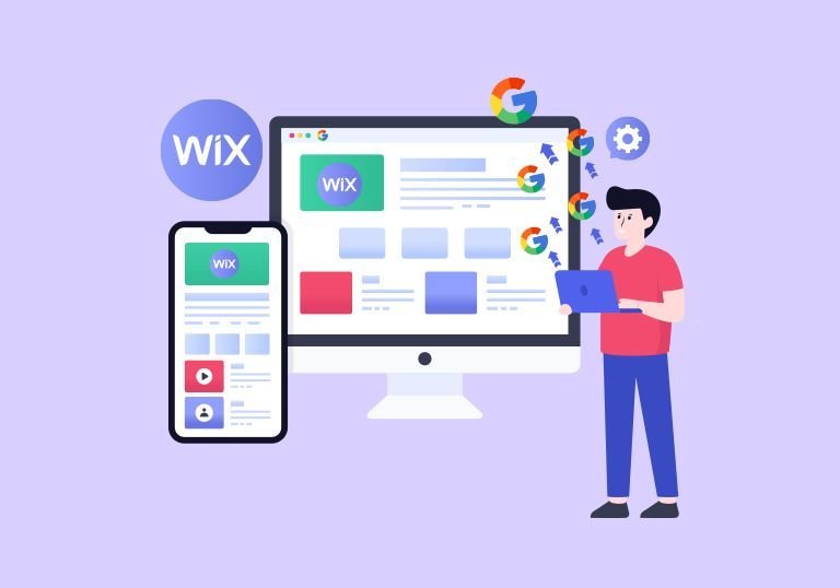
Remember when having a mobile-friendly website was just a nice bonus? Those days are long gone. Today, if your Wix website doesn’t perform brilliantly on mobile devices, you’re essentially invisible to more than half of your potential audience. Google’s mobile-first indexing means the search giant now primarily uses the mobile version of your site for ranking and indexing. Let’s talk about how to make your Wix website not just mobile-friendly, but mobile-first and search engine optimized.
Understanding Mobile-First Indexing
Google made a fundamental shift in how it crawls and indexes websites. Instead of looking at your desktop site first, it now prioritizes your mobile version. This isn’t just a technical change; it’s a reflection of how people actually use the internet. Over 60% of searches now happen on mobile devices, and that number keeps climbing.
For Wix users, this presents both an opportunity and a challenge. The good news? Wix automatically creates a mobile version of your site. The reality? Automatic doesn’t always mean optimized. You need to actively work on your mobile experience to rank well on Google.
Start with Speed: The Foundation of Mobile Success
Let’s be honest, nobody likes waiting for a slow website to load. On mobile, where connections can be spotty, and attention spans are shorter, speed becomes absolutely critical. Google knows this and uses page speed as a ranking factor.
First, tackle your images. They’re usually the biggest culprits when it comes to slow loading times. Compress every image before uploading it to your Wix site. Use tools like TinyPNG or Wix’s own image optimization features. Aim for images under 200KB for standard photos and even smaller for icons and graphics.
Next, be selective with apps and widgets. Every third-party app you add to your Wix site adds extra code that needs to load. Ask yourself: do you really need that fancy social media feed or animated counter? If it doesn’t serve a clear purpose for your users, it’s just slowing you down.
Enable lazy loading for images and videos. This means content loads only when users scroll to it, rather than everything loading at once. Wix offers this feature in the site settings, and it can dramatically improve your initial load time.
Designing for Thumbs, Not Cursors
Mobile users navigate with their thumbs, and your design needs to reflect that reality. Those tiny buttons that work perfectly with a mouse cursor? They’re frustrating nightmares on a touchscreen.
Make your tap targets at least 48×48 pixels. This includes buttons, links, and any interactive elements. Space them far enough apart that users won’t accidentally tap the wrong thing. Nothing kills conversion rates faster than a user trying three times to hit the right button.
Your navigation menu deserves special attention. A complex multi-level menu that works on desktop often becomes a confusing mess on mobile. Simplify it. Use a hamburger menu if needed, but make sure your most important pages are easily accessible. Consider adding a sticky navigation bar that stays visible as users scroll.
Content That Works on Small Screens
Writing for mobile isn’t the same as writing for a desktop. People scan on mobile devices; they don’t read every word. Structure your content accordingly.
Use shorter paragraphs. Two to three sentences max. White space becomes your best friend on mobile screens. It makes content digestible and reduces the overwhelming feeling of facing a wall of text.
Your headlines need to work harder on mobile. They should be clear, compelling, and front-loaded with important information. Many businesses offering Wix Website Development Services in India understand this principle well, crafting content that captures attention in the first few words.
Break up content with subheadings, bullet points, and numbered lists. These elements create natural scanning points and help users find the information they need quickly. Remember, a user on their phone might be standing in line at a coffee shop or sitting on a bus. Make it easy for them to consume your content in these distracted environments.
Mobile-First SEO Fundamentals
Your mobile site needs the same SEO elements as your desktop version, but they matter even more now. Start with your title tags and meta descriptions. These should be concise and front-loaded with keywords since mobile search results show less text.
Schema markup helps Google understand your content better and can earn you those coveted rich snippets in search results. Wix offers built-in SEO tools that make adding structured data relatively straightforward. Use them to mark up your business information, products, services, and reviews.
Working with the Best SEO Agency in India can help you develop a comprehensive mobile SEO strategy that goes beyond basic optimization. They can conduct in-depth mobile usability audits, competitor analysis, and create customized optimization plans that align with your specific business goals and target audience behavior.
Local SEO becomes crucial on mobile since many searches have local intent. Someone searching for “web design services” on their phone is likely looking for help nearby. Make sure your location information is clear and consistent across your site. A professional Wix Website Development Agency in India would emphasize this aspect, ensuring location-specific keywords are naturally integrated throughout the content.
Don’t forget about voice search. Mobile users increasingly rely on voice assistants, which means optimizing for conversational, question-based queries. Include FAQ sections that address common questions in natural language.
Technical Optimization That Makes a Difference
Google Search Console is your best friend here. Set up mobile usability reports to catch issues like text that’s too small, clickable elements too close together, or content wider than the screen. These reports give you actionable insights directly from Google about what needs fixing.
Test your site on actual mobile devices, not just the desktop preview. Wix’s mobile editor lets you customize the mobile version separately from the desktop, which is powerful but can lead to discrepancies if you’re not careful. Check your site on different devices and browsers to ensure consistency.
Implement HTTPS if you haven’t already. It’s a ranking factor, and mobile users are particularly sensitive to security warnings. Wix provides free SSL certificates for all sites, so there’s no excuse not to have this enabled.
Creating Thumb-Stopping Visual Experiences
Mobile users are visual creatures. They scroll quickly, pausing only when something catches their eye. Your images and videos need to be optimized not just for speed, but for impact.
Use vertical or square images rather than horizontal ones. They take up more screen real estate on mobile devices and create a more immersive experience.
Videos should be short, subtitle-friendly, and make sense without sound since many users browse with audio off. Your color contrast matters more on mobile. Screens are smaller, often viewed in various lighting conditions, and users might have accessibility needs. Ensure text is readable against its background, and important buttons stand out clearly.
Also Read: How to Write SEO-Friendly Blog Posts That Rank in 2025
Forms and Conversion Elements
Forms are where many mobile experiences fall apart. A form that feels reasonable on a desktop can be torturous on mobile if not properly optimized.
Minimize the number of fields. Every field you remove increases your conversion rate. Do you really need someone’s company name, or can you follow up for that information later? Be ruthless in cutting unnecessary fields.
Use the right input types. Mobile keyboards can switch to number pads for phone numbers, show @ symbols easily for email addresses, and offer other helpful shortcuts if you use the correct HTML input types. Wix’s form builder should handle this automatically, but double-check.
Place your call-to-action buttons where thumbs naturally rest. On most phones, this means the middle-to-lower portion of the screen, not tucked up in a corner where users need to stretch to reach.
The Power of Progressive Enhancement
Build your site with mobile as the foundation, then enhance for larger screens. This approach ensures your core content and functionality work everywhere, with additional features layered on for devices that can handle them.
When collaborating with the Best Wix Website Development Agency in India, this mobile-first approach should be standard practice. The core user journey should be flawless on mobile, with desktop offering bonus features rather than being the primary experience.
Testing, Measuring, and Improving
Launch isn’t the end; it’s the beginning. Use Google Analytics to track mobile-specific metrics. How long do mobile users stay on your site? Where do they drop off? What’s your mobile conversion rate compared to desktop?
Run regular speed tests using Google’s PageSpeed Insights or GTmetrix. These tools provide specific recommendations for improvement. Set a goal of achieving a score above 90 on mobile and work systematically through the suggestions.
Conduct user testing with real people on real mobile devices. Watch them navigate your site. Where do they hesitate? What confuses them? This qualitative feedback is invaluable and often reveals issues that analytics alone won’t show.
Content Strategy for Mobile Success
Your content calendar should prioritize topics that mobile users search for. These often include “how-to” guides, quick tips, local information, and time-sensitive content. Mobile users want answers fast, so structure your content to deliver value quickly.
Create scannable content with clear takeaways. Use summary boxes, key points sections, and visual elements to break up text. Consider creating mobile-specific content formats like checklists, quick reference guides, or short video tutorials.
Leveraging Wix’s Mobile Optimization Features
Wix has evolved significantly in its mobile capabilities. The platform offers automatic mobile optimization, but you should still manually adjust using the mobile editor. This lets you reorder sections, hide elements that don’t work well on small screens, or create mobile-specific layouts.
Use Wix’s built-in performance tools like Wix Turbo for faster loading. Enable the site accelerator features and take advantage of Wix’s CDN for serving images and assets quickly to users worldwide.
Many businesses working with a Wix Website Development Company in India leverage these built-in features while adding custom optimizations to push performance even further. The combination of platform capabilities and expert optimization creates the best results.
Staying Ahead of Mobile Trends
Mobile technology keeps evolving. Progressive Web Apps (PWAs) are becoming more important, offering app-like experiences through browsers. Consider how these emerging technologies might benefit your site.
5G networks are rolling out, which will eventually reduce some speed concerns, but don’t use that as an excuse to be lazy. Faster networks don’t excuse poor optimization, and not all your users will have access to 5G for years to come.
Final Thoughts:
Creating a mobile-first Wix website that ranks well on Google isn’t about following a single checklist. It’s about fundamentally understanding how your users interact with your site on mobile devices and optimizing every aspect of that experience.
Speed, usability, and content quality form the foundation. Technical SEO and smart design bring it all together. The businesses that succeed online today are those that stop treating mobile as an afterthought and start designing for the devices their customers actually use.
The investment in mobile optimization pays dividends not just in search rankings, but in user satisfaction, conversion rates, and ultimately, your bottom line. Whether you’re building your first Wix site or optimizing an existing one, remember that your mobile users aren’t a subset of your audience anymore. They are your audience.
At Vulture Concepts, we understand that excellence in mobile-first design isn’t optional; it’s the baseline for digital success. Your website should work flawlessly on every device, load instantly, and guide users effortlessly toward their goals. That’s not just good practice; it’s what your customers expect and what Google rewards.